2020 EXHIBITION INFORMATION
A Design Binding is a singularly considered and beautifully executed book covering—a unique work of art in the form of the book. This exhibition features a juried collection of recently made books submitted from around the world, a definitive statement on excellence in fine binding today.
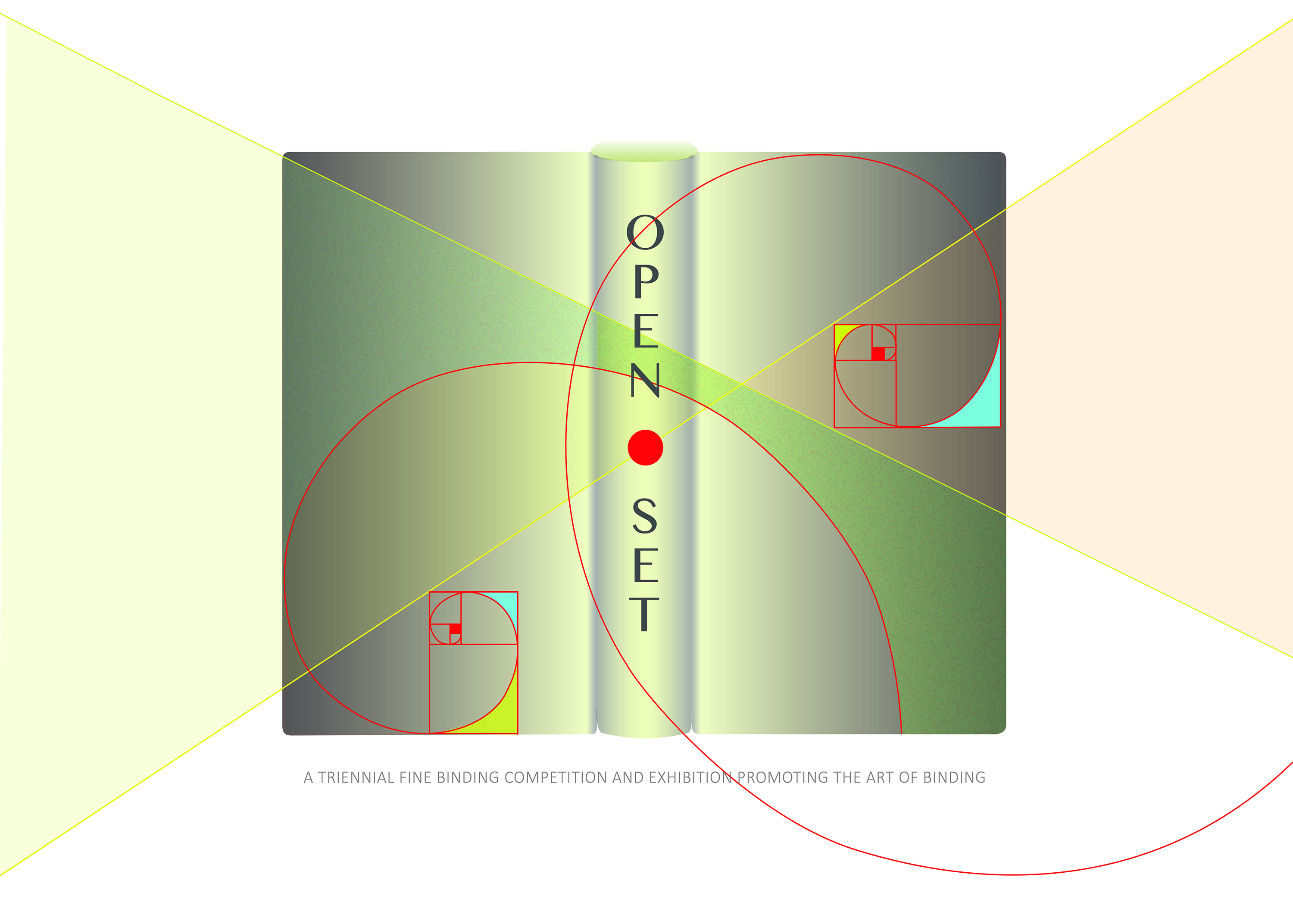
OPEN • SET is a competition and exhibition, a triennial event featuring finely crafted design bindings. Sponsored by the American Academy of Bookbinding, it is designed to encourage both new binders and professionals, and is open to binders around the world. This title reflects the two categories in which the binders compete—the Open Category, in which the artist chooses which textblock to bind, and the Set Category, in which participants bind the same textblock.
All entries were reviewed by a blind jury of three professional binders. The three members of the jury are Monique Lallier, Mark Esser, and Patricia Owen. They spent four days awarding prizes and deciding which bindings would be included in the traveling exhibition you see here. As well, each juror has a book on display. VIEW BIOGRAPHIES
A book’s cover is, in essence, an invitation to explore its content. We invite you to view these books with an eye toward understanding the unique characteristics each might hold. Traditional techniques such as onlay and inlay, gold tooling, titling, and edge treatment are on display—but take note: there is also a variety of contemporary movements within these techniques, as well as unusual structures, materials and statements. The eye will lead you. For further exploration of the interiors of select books, there is a QR code shown below that you may access from your hand-held mobile device. Enjoy!
2020 Exhibition Venues
NEW YORK CITY
The Grolier Club
February 19 – April 25
SAN FRANCISCO
The American Bookbinders Museum
May 15 – July 10
SALT LAKE CITY
Marriot Library, University of Utah
July 31 – October 2
AUSTIN
Austin Public Library
October 13 – December 2
VIEW AWARD WINNERS
VIEW OR PURCHASE CATALOG
VIEW OR PRINT GALLERY GUIDE
Descriptions from the 2020 Exhibition:
THE OPEN CATEGORY
As OPEN • SET was developed as a competition, organizers recognized that some binders prefer an open category, a freedom of choice in expression. In fact, an Open Category is the most common type of call in a binding competition. It is up to the binder to choose and execute a binding on a textblock of their choice. With this consideration, OPEN • SET was born: there would be an Open Category and a Set Category. Binders could register and make a book in one or both categories.
The variety of titles in this category make a very interesting display—from Shakespeare to Kipling, from the US Constitution to Philip K. Dick. There are titles about binders or written by binders, there is poetry, there is a graphic novel. One book exemplifies what is called “the complete book,” in which the binder creates the textblock as well as the binding—an overall and completely cohesive effort that takes the breath away. Private presses are solidly represented, strengthening the bridge between fine press work and fine binding.
The credo of a fine binder is in evidence throughout: each book in this category is a unique interpretation of the content. Each book is singular, reflecting value through clear individuality.
ON THE OPEN CATEGORY BOOKS
The Open Category titles submitted were chosen by the binders themselves. There are books on display in French, German, Spanish and English, a variety that echoes the number of foreign entries in the show.
There are books that utilize many kinds of materials—the most common, leather—but also parchment, wood, paper, stone, and Japanese tissue. There are many styles of structure as well, from a modified Millimeter Binding to “soft cover” structures to double- and triple-board bindings to the New Oriental Binding. These structural decisions allow for both a range and a mix of what becomes possible for a binder to reach their design statement. To aid in this is a multiplicity of more common techniques—such as inlay and onlay, tooling, board build-up or reduction, and wrinkling. These are modified or enhanced by more modern expressions such as layers of leather treatment, combining of different leathers, linking leathers, sanding leathers, sewing through the cover material, painting the cover material, and creating board envelopes that pull off the book entirely to reveal more of the artist’s message.
In this category (as in the Set Category), there are numerous examples of what Bernard Middleton describes as the “meeting guard”. This is a technique that uses a folded stub or onglets to which the textblock is sewn; the meeting guards are what become a faux spine, rounded and backed, and thus respecting the opening of the book as well as the conservator’s credo to interfere with the textblock itself as little as possible.
THE SET CATEGORY
It is not often that design binders are presented with the opportunity to express their artistic interpretations throughout the entirety of a book. With the Set Book, binders were invited to expand their design interpretation beyond the traditional considerations of bookblock protection, to stretch their ideas as if elastic, to go in while executing their binding submission. This was not a requirement, but an open option.
William Blake was a poet of the Romantic period. But he was more: painter, printmaker, philosopher, illustrator—William Blake was a creative. He was touched by the muse and responded quickly if not passionately at the expense of all else. His letter is a tribute to the state of being that he calls “Happy Abstract”, or that place where artists delightfully lose themselves in their work and where the expression leads them.
Maret is a poet of current times, a writer of singular perception, and a printer of taste, honed over years of production. For the Set Book, he agreed to the parameters of a folio format with large margins. His choice of a William Blake letter on the topic of the creative act is superlative. OPEN • SET wishes to thank him for his steady and timely production, and acknowledge that binders do not often have the opportunity to bind Maret works. The choice of binding the Set Book is a choice that bridges the world of fine print with the world of fine binding. We found that this bridging led binders to their own place of “happy abstract.”
VIEW VARIOUS ARTISTS’ WORK INSIDE THE BOOKBLOCK
ON THE SET BOOK, IN THE WORDS OF RUSSELL MARET:
Happy Abstract — A letter from William Blake to Thomas Butts Dated 11 September 1801
The letter that William Blake wrote to his friend and patron, Thomas Butts, on September 11, 1801, is of a type that most artists have written at one point (or many points) in their career. Were it a form letter today, it would read something like this:
Dear XXX, Thank you for your continued support, I could not make it without you. However, I still have not completed the work for which you paid me. Please do not take this inattentiveness as a reflection of my feelings toward you or your work, but I have been busy with other things that I find more interesting. I am sure to finish your job soon. Best, XXX.
The difference between the letter featured in Happy Abstract and most other letters written on this template is, of course, that Happy Abstract was written by William Blake. Blake is not simply busy. He is daily pulled away from Butts’ commission into a world of abstraction, a pull against which he is powerless to resist, rendering him a “wretched, happy, ineffectual labourer of Time’s moments….”
When Lang Ingalls and I first discussed printing Happy Abstract for OPEN • SET 2020, Lang was specifically interested in a book that had minimal text on the page, hoping that binders would not only design the binding of the book, but also be lured onto the books’ pages. Blake’s letter seemed a perfect fit for the project. It is a short text that is full of evocative visual prompts, allowing me to lay the book out with only one line of text per page, leaving lots of unused space for the binder to explore. The text begins high up on the page and progressively works its way one line lower down the page with each spread, until ending just at the bottom. The text is handset in Bauer Bodoni Italic with Donatello Eclaire titling, and printed on Zerkall Nideggen paper.